Tuesday 26 November 2013

glass and interior

been trying to get my glass material where i want it and trying to get the interior sorted so i started by playing with the alphas for glass i wanted a sort of tinted feel to the window so i painted in the alpha to show more transparency at the top like a limo window to give a more pimped up look.

i also needed to change the material of the interior because at the moment the seat inside were showing high levels of reflection which isn't what i want to show i want me seat to be quite a flat leather look with just small bits of reflection. i couldn't figure out how to get the material to show up on the interior without using the first id i manged to figure out that it needed to be under the glass id and after that it worked fine and gave it a much more realistic look.

i think my vehicle materials are nearly done now  ive manged to get the right level of reflection i wanted but at the moment my metal is still looking flat so ill need to tweak that some more.

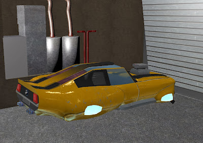
 Now at the end of the project I actually have a little time to really polish things up i deiced to make a lightmap I did that and then painted over the top of it to get soe soft shadows once did this I wasent realy happy with my cube map so I redid it with the lightmap and came out a lot better. Finishing touches I went back and added in some posters to the environment and opened the garage door so you can see out into my level and I think  just those litle things added more divesity to my level which was looking abit bland.  I also went in and did some finishing touches on texures and emissive map realy trying to get the vehicle to pop out the scene.


maps and shader's


finaly have all my shaders working together fine recently ive just been trying to polish up all my maps seeing how they work with the shaders i decided to take my bump level down abit because it was making the light bounce to cracked and not smooth enough i still want the water stained look but it was to much at the time but with abit of back and forth ive got alot closer to how i want it to look. i also moved on to making my own cube map with my strip lights i may have to redo it but for now its working how i want it to showing the long lines of line which is what i wanted in my scene. it took me a while to figure out how do a cube map because the shaders make the renders gray-scale in the end i saved of a new version just for the cube map and used normal material just for the shaders. 


 i also played around with my alpha in the cube map to see what results i could get for the high dynamic range i tried doing different lines across it to get a galvanized look on my car paint but i dint like how it looked so i tried to focus on simple lights and i think it cam out alot better. 


putting some time into my emisive map i think really made my model pop out abit and makes it alot more interesting especially since its mend to be a hover car. i still have abit to do with the environment light maps and such but im happy with the rate its going and im on schedule. 

Wednesday 20 November 2013

fmp ideas


my fmp ideas hace changed alot my mind seems to go through so many idea i cant stick with one but i did come across the idea of a bigger gang character project i relay like the idea because the characters are so cool and thought about i could get alot reference through tattoos shops i could make alphas which could look really good. but i was getting ahead of my self before ide even started the main problem was i dont the think the project had enough direction or design to just go of and design biker character seemed abit pointless with no story to so after feedback i did some research and found a book about biker characters called under and alone about a biker enthusiast working for the ATF and goes undercover and SPOILER ALERT takes down multiple people in the biker gang  i like the idea and thought i could take it somewhere but after feedback it was pointed out that a game just came out about a biker gang which put me of slightly was also pointed out that all the character are quite similar in build  and age.


so i went away brainstorming new ideas i like the idea of doing something real like a culture in history biker gang or much father back so i did some research and tried to find some good book about famous empires and i found a book called wolf of the plains, about the story of ghengus khan which really intrigued me because the mongols are very interesting people especially around that time. 
i started reading the book and its very good and has allot cool characters with alot of diversity more that i originally thought . before getting carried away with the story i did some moodboads to try and get a feel for the characters i could design.


after mood boarding i found there's alot of room for me to concepts some really interesting characters and after going through more of the book there's alot of very descriptive text.
i have a few different ideas for my project revolving the book there quite a few scenes and characters i could pick from because to book ranges when ghengus khan is 10 to 20 starting from his childhood to when he concurred the plains and made the mongol nation. i really like the idea of modeling a scene from the book so i wouldn't just have characters for my fmp but 1 or 2 characters and environment work of about a months work's, or im also considering doing one of the war pony's fully kitted out instead of character. 


updates

finaly starting to get somewhere with the shader's the past couple days  ive been working with the vechile and environment shader's and focusing on finishing texturing mainly for the environment so its out the way. so far my main thing is lots of litle tinkering with the textures and shaders ive found you need to do the shader's in quite specific way otherwise i struggle to get it working. the main thing i need to rember is that all the screen shots will be taken in side my scene and not from above view because its confusing with the shader's focusing everything one sided but once i got my head round that and flipping some stuff and re ranging the scene so it works better its ok. 


also struggling to get my speculer map to work braking down the example scene there is a spec map in the level but when ticking on and of doesn't make a huge difference so i do need to tweak around with that now ive added my first draft bump map i can see how it changes the reflections im trying to use the bump maps to help get the light to bounce of it like dirt or galvanized metal look and trying to keep the gloss down.  

 i also decided to use long strip light because i think it will give me some lone nice reflections rather than two detailed squared reflections.at the moment my scene looks pretty bair im hoping i can get a big bulk out of the way this weekend depending on how many errors and tweaking i run into so i can flesh out my scene more. because its a hover car i want some neon lights like the example scene so looking how the example scene was made i made my own alpha glow with some ilimuention i may add a light in as well to make it bounce of the environment more as well an emisive. 
 i also decided to block of the environment so its a closed garage i did this because i want to give the impression of dinky rundown garage if i have time i want to add in grime alphas and maybe some water puddles from a drip roof. but i think for my car to fit in im going to have to mess it up some more still far to clean.

the bump map brings nicer light reflections then before but i still think it needs alot of work it still to me coming of as very plastic also once ive got my own cube map in there i think my scene will look allot better. 

Monday 18 November 2013

progression

final paint over and color scheme in the end i decided to go for a rundown classic yellow and black stripes because i think i fits the theme that i wanted to go for.and also wanted to a neon baby blue and i think my design flows quiet nicely and doesn't look aggressive but looks like its powerful. 


i plugged in the shaders and using the example cube mape just so i could get a feel on the base color with the gloss on. at the moment with just the basic shader' on it looks far to glossy for my design im going to have to figure out how to get a grimy shine i think ill be able do it through the spec and diffuse maps especially the spec because i get some nice bounce light or rained on murky stains stains in the cap paint because i think that looks better then the ultra glossy show car.


ive also started to think about the environment something quite simple maybe a simple suburban american garage looking out on the open Terrance ide like to be more elaborate with the surrounding but the first priority is the vehicle shaders i plan to build the environment quickly so if  have time i can come back to it later.


Thursday 14 November 2013

mesh construction 

once the main part of the mesh wash blocked out i started adding in details like engines and and bumpers and hood detail i tried to focus on keeping good flow through the mesh aswell as detailing i wanted to keep it quite a simple mesh so that i can really focus on the shader,


Saturday 9 November 2013

concepting 

know i no i want to a future mustang i drew out some ideas and then drew out some orthographic so i can start a base mesh and do some paint overs i really want the car to have a classy feel like as if it was an relic in the future world a very old car compared to what are driving round in there . i think ill try and show the classy style through the paint job and really shiny like someone been taking very good care of there classic car.  
once i had my design down i moved on to thumb-nailing  different accessory for the car like different types of hoods and bumpers front and back. and exhaust just really quick thumbnails to get an idea of things i could ad to make my car more interesting.


i then did did a quick block out and render out some shots and did a paint over  so i can get a feel for the paintjob and textures i want to paint on im then going to push these further and do several color layouts 


once i had my orthographic's down ive started strip modeling my mesh i need to try keep a variation in hard edges for the windows and soft surfaces for the hood my preferred way of modeling is box modeling because i find i can see what im building and how to mold it easier but i think strip modeling works better when trying to get nice flow lines in vehicles. now ive blocked out the main part of my car i need to pay attention to smoothing groups but doing that now its all looks fine smoothing groups and mix of using relax really helped smooth out my model.
i tried playing with the nurms to get higher polly mesh but i found that even with controlling the smoothing groups still smoothed my mesh out to much an think the geometry is unneeded as it says in breif that 10'000 tries is not requirement. 

Thursday 7 November 2013

vehicle project initial ideas

initial ideas reading over the brief i i think i want to get abit simpler with the design on the this project a straight forward simple design so i can really focus on the shaders. so my initial though was a hover bike like the idea of a hover vehicle because i can take away the wheels and really focus on the metal textures and its reflections and also a good excuse to use neon lights to show it hovering and to show through on the emissive maps.
 after some thought i decided on doing a hover car instead because i relay like the idea of doing a future car from mustang or corvette and redesigning it as hover vehicle.  

so i did some mood boards and sketches at the moment im leaning more towards a mustang but i can still take elements of the design from the corvette ive decided to go with and older sting ray mustang because i think will come across better as hover car with its smaller sleeker design.
still trying to work with the very simple smooth design im also toying around with themes and paint jobs whether to do a classic black stripes race car to show more of the original design or to do a souped up cop car.


Friday 1 November 2013

rooftop reflection


rooftop one month project finished my plan for my roof top was to build big interactive assets and to really push the project as far as i could throughout this project the main think i wanted to achieve was an interactive level in a game something that someone would want to play through and i think ive managed to achieve something like this because of the way you start in an elevator that takes you the top level and there lots of cover and that you can make your way through the map higher and higher till you reach the top of the crane. i varied abit from my original ideas like starting on the crane and working your way down because i felt it wasent really a feasible idea also i dint make as many small asset's as i original thought like lunch boxes and rubbish about just from not having enough time in the end and by the end i think  i pushed my textures as far as they could possible go without of space i had in the end i ended up with sixteen two-five-sixes.  but im glad i made my last minute revision for textures especially for the crane getting a much better colour and metal texture really gave a better contrast in the level and stopped everything from look so similar and boring. i tried to really maximise my big textures and use as many tillable as possible because of the nature of how low resolution the textures are but im quite happy with them especially the skyscraper for a 256 came out quite nicely.

the main thing i think that would of improved my level was better lighting i seemed to have allot trouble with lights and colour i think they ok in the end but i think i could of made them look allot more atmospheric for a night scene, and i couldn't manipulating in engine lights like how i wanted my flood lamps to look so i resorted to using alpha cones which look better but still not as good as id of like because my idea was really strong lights shafts . also i would of like more assets because i modelled it modular i think i may have done to much modularly and not enough unique elements. also if i had more time in the project i would have give it a weather theme but i dint feel like id have enough time to learn how to do that with all the new things ive had to learn on this project but i would of like to a really cold night with frosting the metal and maybe even light snow or really dense wet fog would of been nice i did play allot with the fog and sky box but i think it could of been pushed more with an overall theme like frost  and reflective surfaces . i think i could of have used some more interesting textures maps  in stead of the normal bump diffuse an specular i would like to have maybe some parralex maps and reflective maps but time got away from me but i think if i did again i could do the project alot faster and allot more efficiently.

i think what helped get through the project on time was putting things in udk within the first week really getting out the ideas in  the first few days and working on it straight away and not spending to much time concepting an rushing to get everything in level because i knew udk interactive things that i hadent done before could potentially slow me down alot so i tried to start those as soon as possible. which also was one of main problems was making my interactive assets did take some time setting up my lift and spawn point was the main think that miffed me for the longest i found out that i already had a spawn point hiding of somewhere easy fix once i knew where it was , i had to do alot of tweaking with the elevator to get to work the way i wanted it to in the end i changed the hole shape by making it open like a window cleaners elevator , but i think it made it alot more dynamic and interesting to play rather than a big boxy elevator with one window to see out of an also would have used more texture space. apart from that the project seemed to go pretty smoothly just chipped away at it and slowly built up the assets and filled it out.

the lessons ive learnt in this project are problem the most ive got out of a project so far because the last big level i built was in a team which is very different to making a level on your own. i think this project really brought my work into its own working in udk its allot more comfortable and no where near as daunting as used to be and my workflow speed has massively improved. my biggest task in this project was my interactive asset like my crane elevators doors and sound which now i can do well enough .

overall i have learnt alot from this project there's always things that could be improved with more time but my main thing i think ill take away from this project is to really organise my time efficiently and now i no how long things take to build in your own level so i can much more efficient in my future projects.