Final Major Project
Review
My project was about Genghis Khan's early life before he became Khan. I really wanted to portray a scene from the book by Conn Igguldens, Wolf of the Plains, because of how captivating and in depth the book is. I knew it would have a lot of resources for me to describe and the characters are very visual which gave me room to play around.
My project was to describe a scene from the book and I chose an early chapter as the book ranges from Genghis' father before he's born up to middle age. I chose this chapter because I thought it could be portrayed well visually. The scene is about Temujin's capture by Toelui. He has been tortured at the camp site before being taken away. I tried to show this through the characters and environment. The environment , by leading you into the camp site with clues as to the narrative, and the characters through their visual style and pose. For example, Temujins face clearly shows that he's been beaten and is held in captivity. This helped massively in giving my project depth and diversity.
One of the main things I wanted was to have a large range of characters. In the book there are several characters I could choose from . I may, in the future ,find time to redesign some or further my project but I chose Temujin for the mean time. Temujin is the main character and I elected Toelui because he's described very differently. Toelui provided a very different scope for designing which keeps the project diverse. The reason I opted for the Mongolian horse was because as I have progressed as a 3d artist I have always wanted to do a project where a animal could be a focus. Mongolian horses look very different to the English everyday horses we are used to. I think it makes my project intriguing. The chapter in the book enthralled me as I've also always wanted to try out doing a winter environment with falling snow and powder on the ground. I think it is more provocative than bare mountains.
For my fmp I really wanted to push myself with the workload. I chose to take on a lot and aimmed to get a great deal done. So I had to work at a fast pace, for myself, but I think it paid off. I gave myself a month for each part of the project which I then split into three .Then I made sure I had enough polishing time to bring it all together. A month per character which was not too bad, month for the horse and level. In hindsight I would of allotted more time because i didn't think the horse would take as long as i did.
This project was one of the first times I've incorporated a sculpting software, like zbursh, into my character workflow. I underestimated how time consuming sculpting can be. Working on the first character in my project, Toelui, I ran two weeks over the time I had originally allotted my self. I opted to work Toeluis' character along side Temujins when I ran overtime. This was to make sure i didn't run out of time and have to cut my workload down. After I completed my first character I managed to finetune my workflow of building and sculpting. As I handled the back and forth flow through software I got a lot quicker. This helped me to catch up for Temujin and my horse. Overall I am happy with my time management. I focused on using the "should", "could", "would" system to keep my project on track.
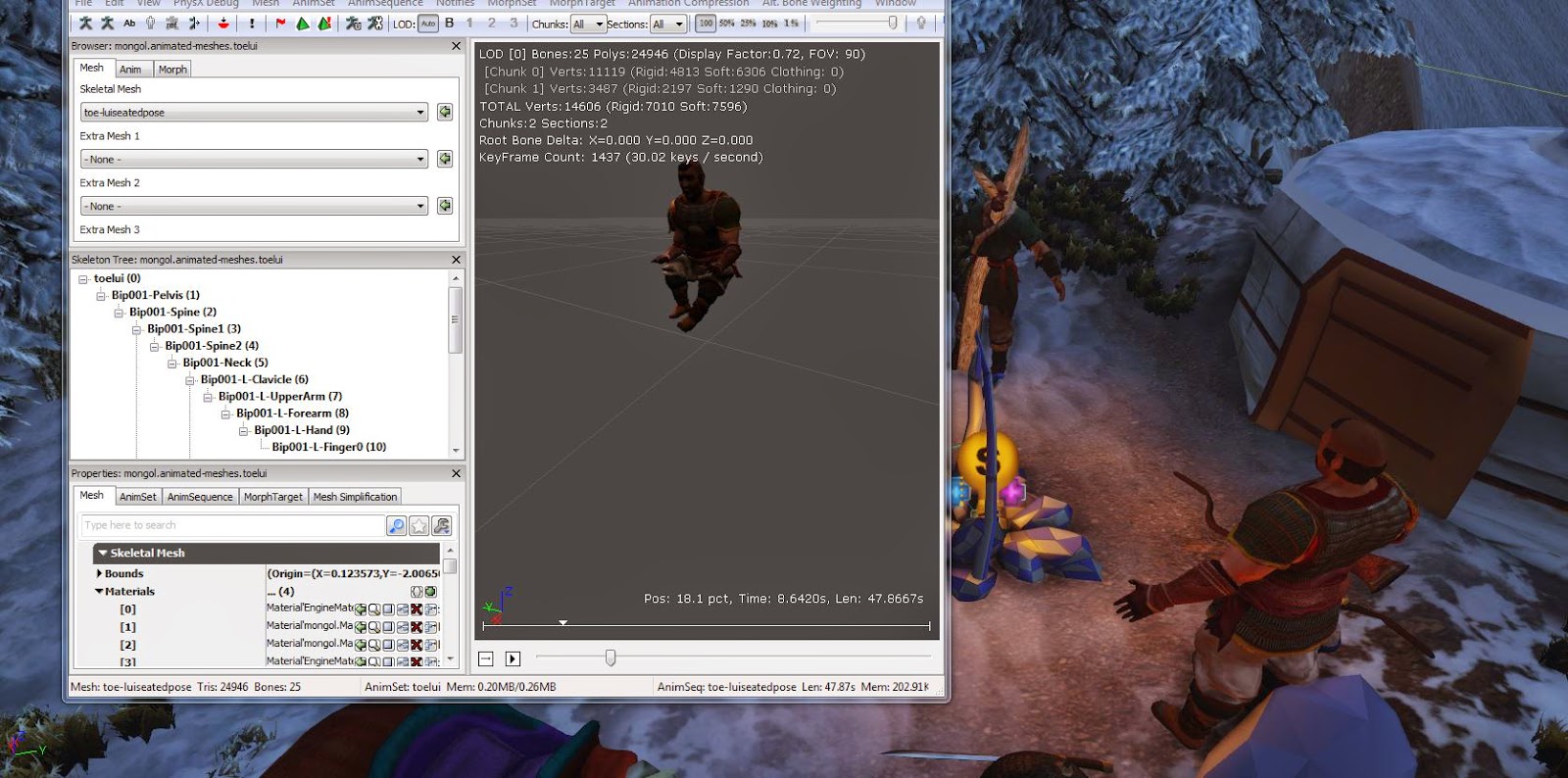
I chose to use udk , 3ds max and Zbrush for the main bulk of my workload. This was because, apart from Zbrush, I was very confident with going back and forth between these softwares. With setting my sights quite high for this project I didn't think I would have the time to learn a new software like mudbox cry engine. I didn't come across many hiccups with the programs that set me back, very luckily and I manged to keep on track for the most part. The only real issue I had were in my level tweaking, towards the end of the project, trying to get the shadows working functionally with skeletal meshes and terrain maps.
I think the most successful part of my project is my second character Temujin. It was a more efficient character, model texture and design, because I was already in the full swing of the fmp. I think he's an interesting character because of how damaged he is, which I don't see a lot in 3d models. The amount of bruising and swelling brings another dimension to the character, which I don't think Toelui has.
I am also very pleased with feel of my level and the atmosphere. I put a lot of time working on the lighting and mood with use of particle effects which I haven't touched before. Which brings a lot of life to the level. I think it is quite important ,because its not a big level and not heavily populated with assets. Having them interactive, like animated characters, I found helped fill out the level.
The part of my project that I think I could of improved, with more time, is mainly my horse. I should of realistically given myself a month. I should have viewed it as another character, rather then a two week project. With rigging, I think I found it harder to portray. Due to how different they look from normal horses. I tried to find a balance between what the viewer would be used to seeing and what was authentic. In the early stages of sculpting I took a lot of editing to try get it look realistic. With the time barrier I gave myself I didn't get to bring out as many of the different materials in the textures as I would of liked. This was one of the main reasons I chose the horse. The range of textures, fur, the leather fabric and metal guards could have done with more time to tweak. Overall I am happy with the result. It helped spread out my level, having an animated horse a little further away from camp tied up, to break up some of the Forrest.

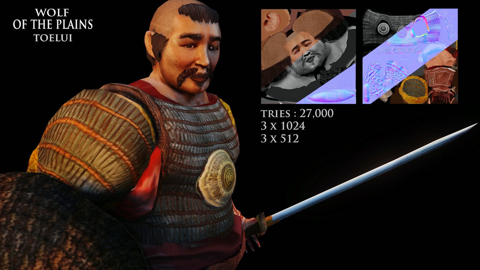
Toelui, over the course of the project, was, I think the part I had to rework the most. The sculpt, the style and the Armour. However I am satisfied how he looks in the game, in particular with the way the light bounces off his Armour.
I think my problem at the beginning of working on this character, was trying to be too subtle.
I did not make him big enough or fat enough. I think once I brought Temujin up to a similar level, I could compare them. I worked on them together and became a lot happier with changes. He is meant to look very powerful and terrorizing next to Temujin. I think I manged this successfully ,with a heavy set body, bald head and blood shot eyes. These gave him a bullying aura which is intimidating.
Over the course of this project I've had to learn a lot of new techniques. This has been interesting and challenging. It stopped the project from getting too repetitive. For example. I used the cad animation system for my horse which I found easier than manipulating a biped structure. I found quicker tools to enhance my workflow, like the terrain brush, to build parts of my environment .These worked well and didn't take away too much time especially since my project revolves around my characters and not my level.
If I had more time for this project, I would of liked to expand the environment, to put more time into expressing the narrative of my project through that. I would of also liked to of made my characters more interactive. Maybe to of introduced my level with a cut scene of Temujin being captured and maybe another character. However, I realize that's quite ambitious. I think my project has been successful because I manged to achieve everything I originally intended. I brought more scope to my project than thought I had time for with the interactivity. I enjoyed trying to display the narrative of my project, having an underlining theme and having clues like the little things that make the project more enjoyable. I think I've learnt quite a lot from working on a project for this amount of time. If i were to do it again, I would be more organised and break up the project more. Rather than do a big chunk of animating or sculpting I would do bits throughout the project. Over this long a time, projects can become preemptive but I think I've got my work to the standard I wanted to achive and finsihed the project happily and not rushed of panicked.


